This weekend hosted one of our big fundraisers for Child and Family Agency. This organization promotes the well being and development of children and their families. It helps to meet the needs lacking in physical, emotional and intellectual care and nurturing. It is an honor to be apart of this agency and to support our auxiliary.
The event was months in the making, planning and execution. A job well done ladies and it was enjoyed by all. Over the span of four days we were treated to many wonderful lectures, meet and greets, and design tips. Lucky for me, we are just about to embark on redoing our dinning room. I walked away with a whole new list of creative ideas {please insert my husband's scream of enthusiasm} to embark upon.
I was there in support of my fellow members as my event isn't until next spring ~ you'll hear more about that as the time approaches. We've been looking forward to meandering through the vignettes for quite some time now. Not to mention that I was personally looking forward to meeting Alexa Hampton and hear her speak. Her new book is simply amazing.
It's fair to say that I'm not a designer and I don't pretend to be one. I know what I like and often can't explain why I do other than "it just fits my style." Not that I even really know how to classify my style.
Enjoy the tour ~ I'll try to keep it brief :)
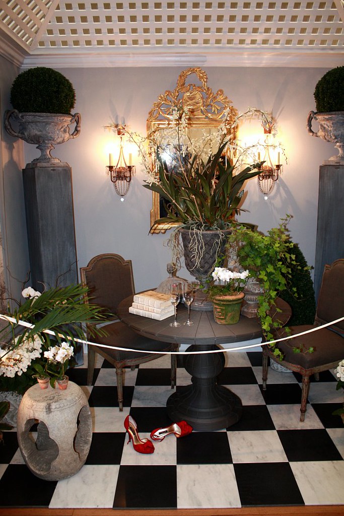
A Garden Room ~ designed by Larry Hamre of Lawrence Hamre Designs in Essex, CT
I just need to figure out where this will fit into our home/ the addition we will be building to house my "new" needs.
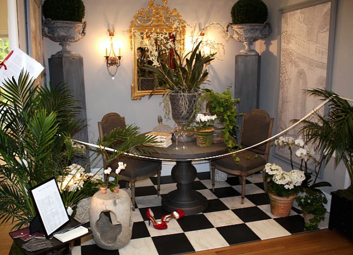
Did you pick up on the red shoes? They go with the red lip stick on the champagne glass.
I'll take one of everything in these photos; thank you.
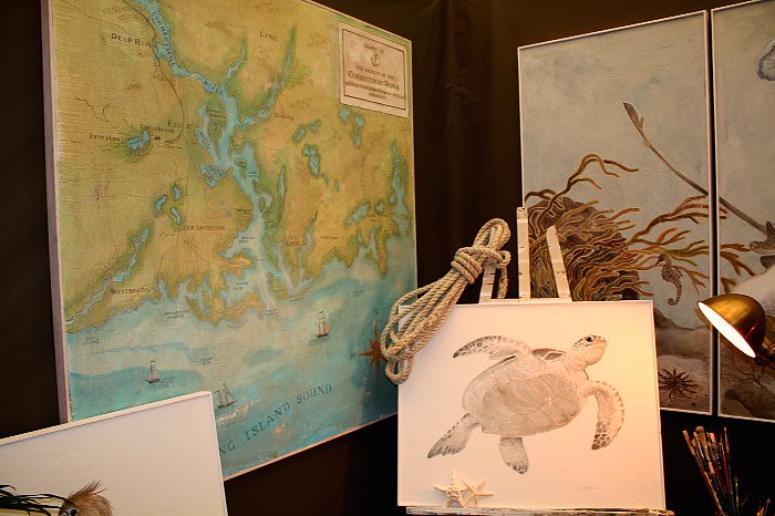
Artist's Atelier ~ designed by Melissa Barbieri of Melissa Barbier Studios in Essex and Greenwich, CT
I spent a few extra minutes chatting with Melissa about the possibilities of turning our round oak table, similar to hers, into a coffee table with such a painting on its surface. We have {compliments of the Navy and living on the coast} many nautical hints in our home that I'd like to showcase all together in our family room.
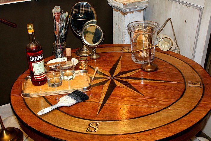
While it's hard to picture the true beauty, Melissa painted this chart as well as all the other framed art ~ this is way beyond my paint by numbers ability.
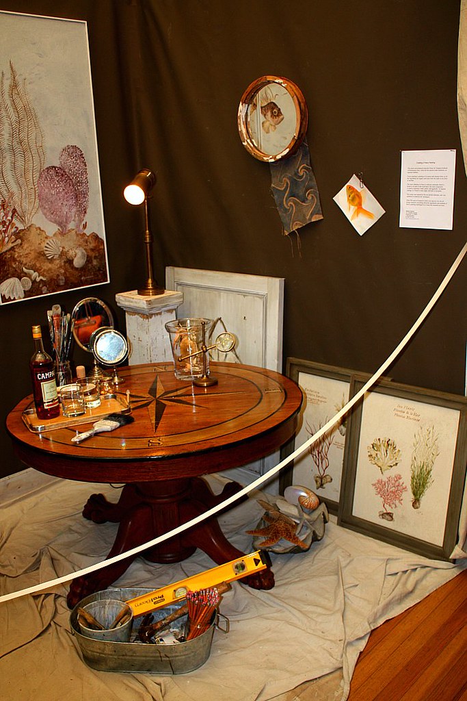
A Slice Of Time ~ designed by Victoria Vandamm of Greenwich, CT.
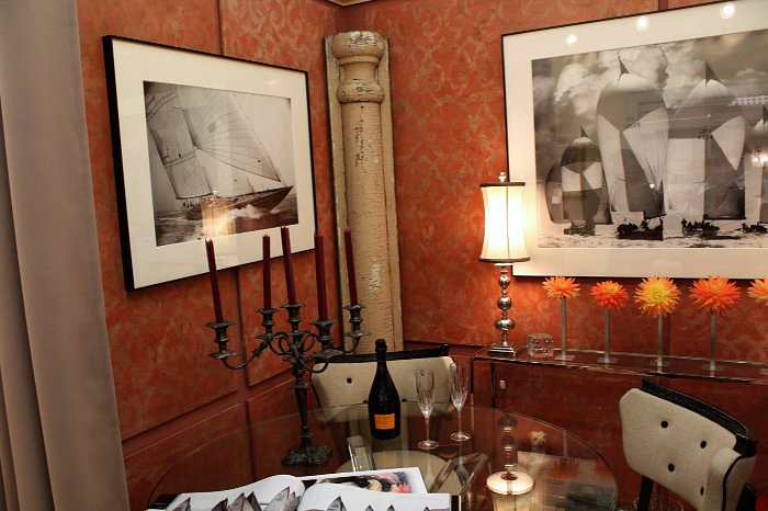
This vignette grabbed my attention. While the colors aren't of those that are featured in our home, the design would fit nicely. If you look closely, you will notice that the "walls" are really Venetian plaster that has been stenciled and then distressed. I was thrilled to speak with Victoria about color balances as well as Julie who designed the stencil and created the walls. We will be in contact as I would love to do this in our dining room {once again, insert husband's gleeful response}
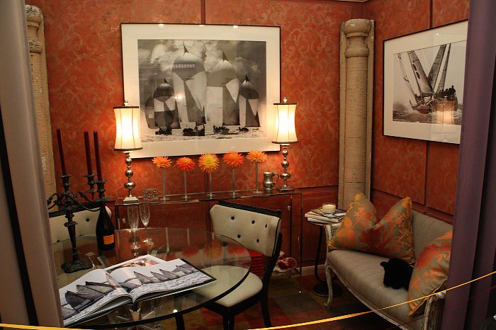
We have just the sailing art waiting in our basement for their new homes.
Jewelry Box ~ designer Melissa Linday of Pimlico in New Canaan, CT
There was just something about this design that mesmerized me and called me back more than once. I have nothing like it in my home and yet I was dreaming of how to incorporate such a look. The items on the dresser were just lovely. I've always had a fondness for mercury glass. After this weekend I'll be adding more to our home.
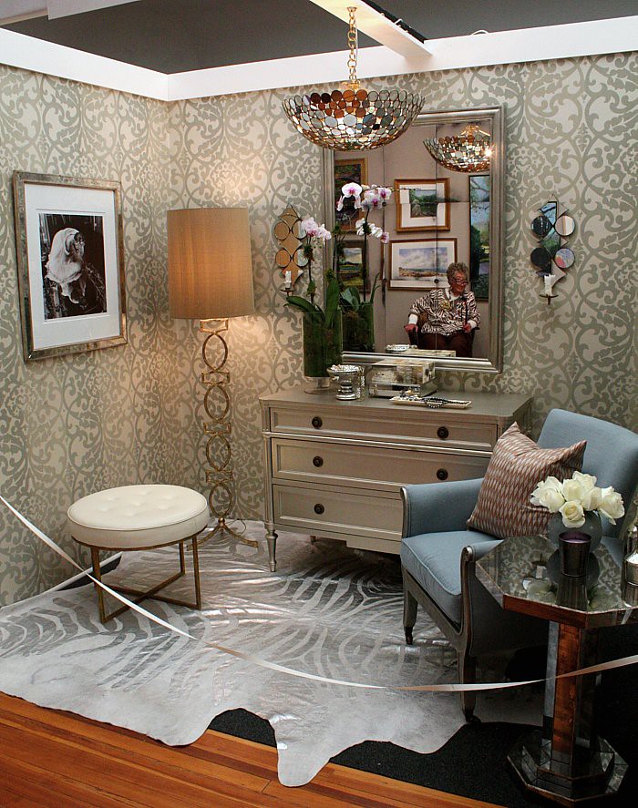
Please note that the mirror is picking up the reflection of one of the volunteers of the museum.
Love, love, love the wallpaper. Hmmm ... there must be a room in our home that is in need.
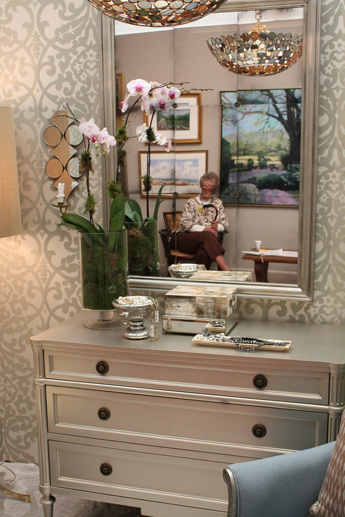
Kev, if you're reading as I know you do from time to time ... just a reminder that my birthday is coming up and anything in these photos will do :)
The framed photo was absolutely beautiful!
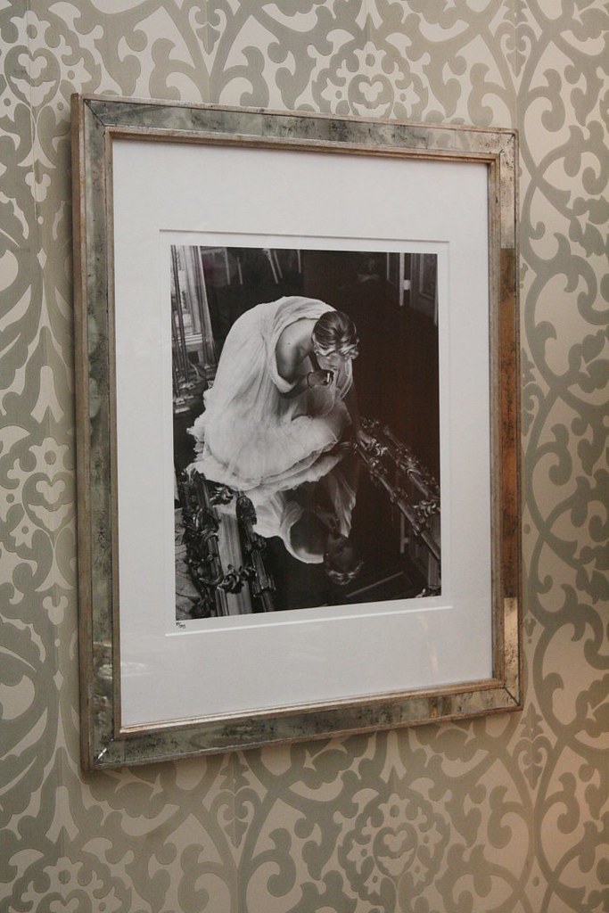
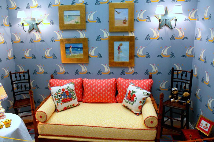
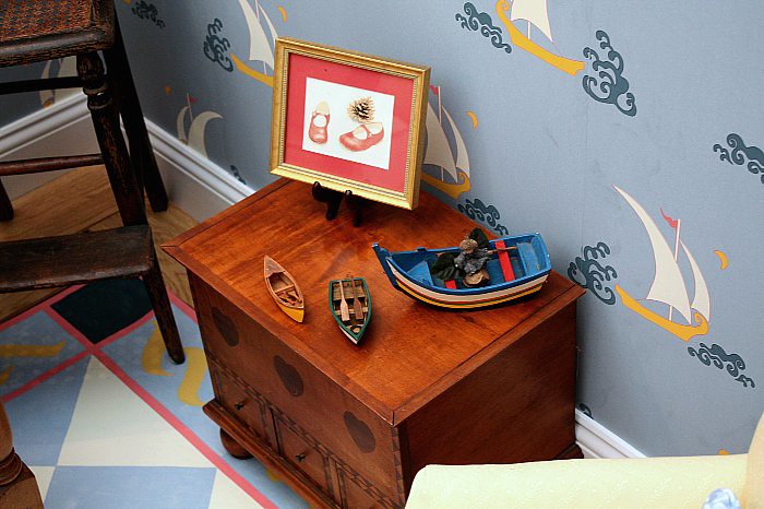
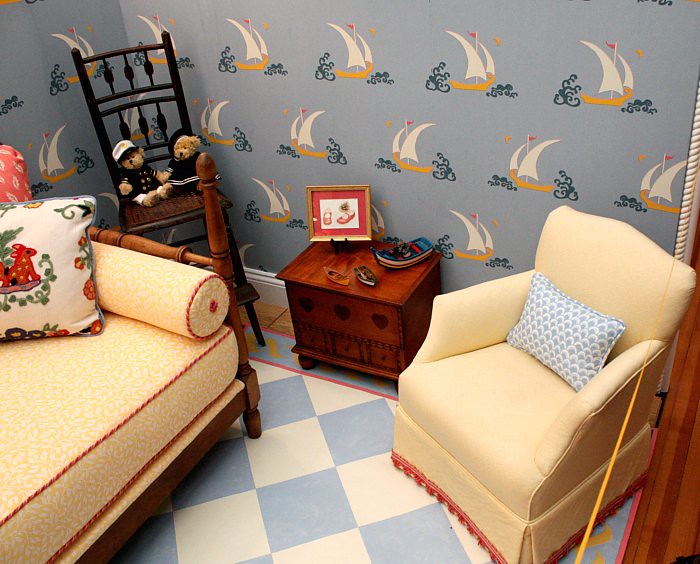
Safe Harbor ~ designed by Ellen White of Boxwood Interiors in Old Lyme, CT
Nicholas may be just a tad too old for a bedroom redo but if I had it all to do over again, I'd copy this exactly. Unfortunately, my photos don't really show the true colors due to the poor lightly.
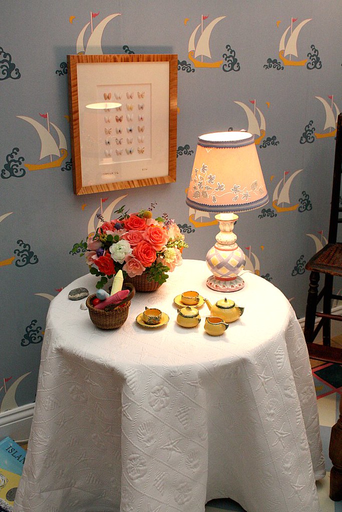
The butterflies are shells ~ so pretty.
All the furniture is miniature for the little bodies to enjoy. Have you spied all the harbor hints?
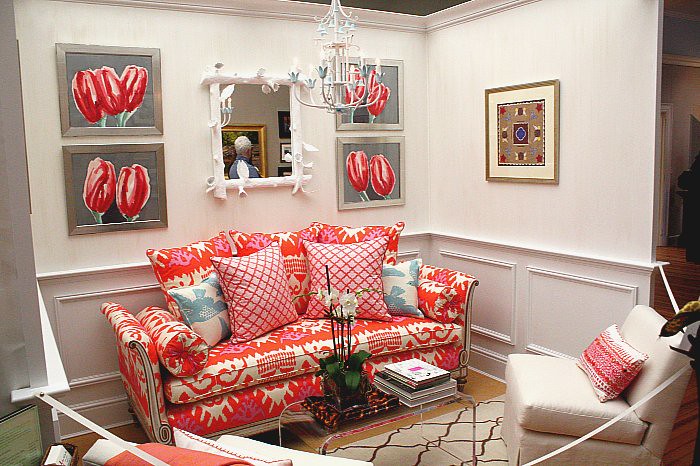
Hannah Childs Interior Designs of Old Lyme, CT
If only I could pull this off. The tulips are amazing and the colors and furniture design are truly magnificent!
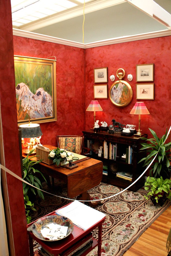
The Dog Study ~ designed by Paula Perlini of Paula Perlini Inc. in New York, New York.
This is my husband's new study {he just doesn't know it yet} or man cave. He and the dogs will spend many hours together surrounded by the subtle "man's best friend" motif. The little pillow reads ~ what part of woof don't you understand? Oh, so very true around our home these days.
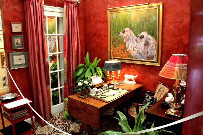
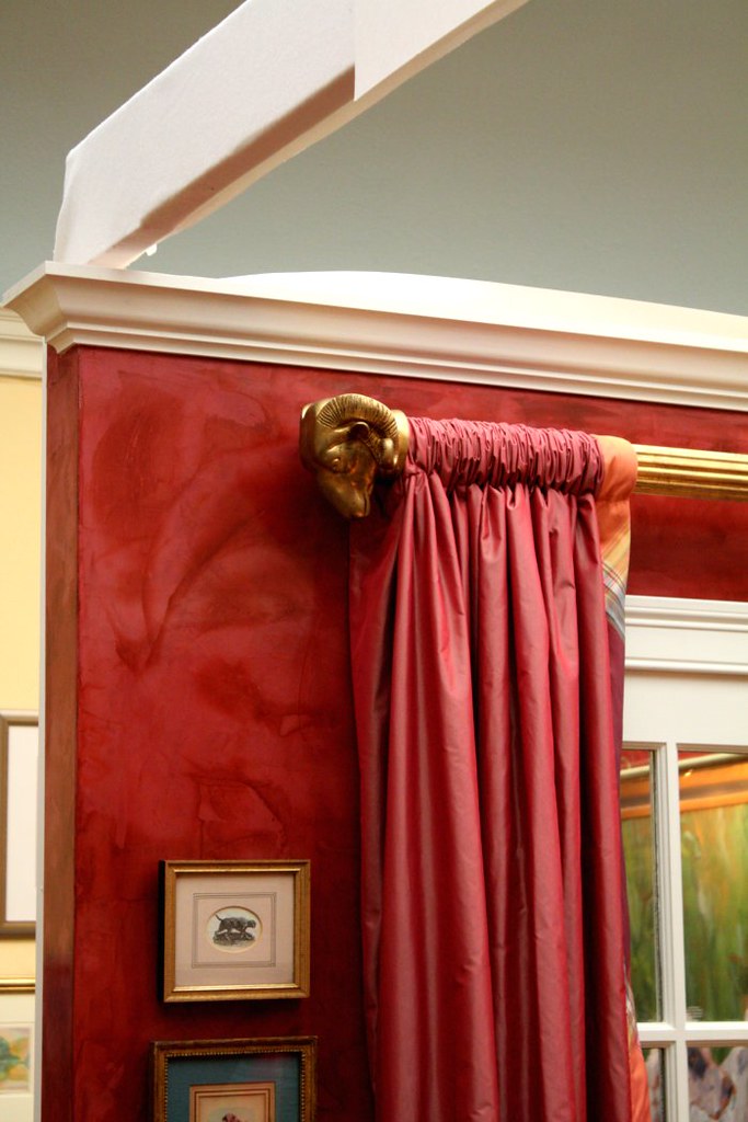
These curtain rods are a wonderful representation of his time spent at the Naval Academy.
As you can see, I will be very busy in the next few months {years} implementing all my new ideas into our home. This may require a large loan or possibly a second job for my husband ;)
The event was months in the making, planning and execution. A job well done ladies and it was enjoyed by all. Over the span of four days we were treated to many wonderful lectures, meet and greets, and design tips. Lucky for me, we are just about to embark on redoing our dinning room. I walked away with a whole new list of creative ideas {please insert my husband's scream of enthusiasm} to embark upon.
I was there in support of my fellow members as my event isn't until next spring ~ you'll hear more about that as the time approaches. We've been looking forward to meandering through the vignettes for quite some time now. Not to mention that I was personally looking forward to meeting Alexa Hampton and hear her speak. Her new book is simply amazing.
It's fair to say that I'm not a designer and I don't pretend to be one. I know what I like and often can't explain why I do other than "it just fits my style." Not that I even really know how to classify my style.
Enjoy the tour ~ I'll try to keep it brief :)
A Garden Room ~ designed by Larry Hamre of Lawrence Hamre Designs in Essex, CT
I just need to figure out where this will fit into our home/ the addition we will be building to house my "new" needs.

Did you pick up on the red shoes? They go with the red lip stick on the champagne glass.
I'll take one of everything in these photos; thank you.

Artist's Atelier ~ designed by Melissa Barbieri of Melissa Barbier Studios in Essex and Greenwich, CT
I spent a few extra minutes chatting with Melissa about the possibilities of turning our round oak table, similar to hers, into a coffee table with such a painting on its surface. We have {compliments of the Navy and living on the coast} many nautical hints in our home that I'd like to showcase all together in our family room.

While it's hard to picture the true beauty, Melissa painted this chart as well as all the other framed art ~ this is way beyond my paint by numbers ability.


A Slice Of Time ~ designed by Victoria Vandamm of Greenwich, CT.
This vignette grabbed my attention. While the colors aren't of those that are featured in our home, the design would fit nicely. If you look closely, you will notice that the "walls" are really Venetian plaster that has been stenciled and then distressed. I was thrilled to speak with Victoria about color balances as well as Julie who designed the stencil and created the walls. We will be in contact as I would love to do this in our dining room {once again, insert husband's gleeful response}

We have just the sailing art waiting in our basement for their new homes.

Jewelry Box ~ designer Melissa Linday of Pimlico in New Canaan, CT
There was just something about this design that mesmerized me and called me back more than once. I have nothing like it in my home and yet I was dreaming of how to incorporate such a look. The items on the dresser were just lovely. I've always had a fondness for mercury glass. After this weekend I'll be adding more to our home.

Please note that the mirror is picking up the reflection of one of the volunteers of the museum.
Love, love, love the wallpaper. Hmmm ... there must be a room in our home that is in need.

Kev, if you're reading as I know you do from time to time ... just a reminder that my birthday is coming up and anything in these photos will do :)
The framed photo was absolutely beautiful!

Safe Harbor ~ designed by Ellen White of Boxwood Interiors in Old Lyme, CT
Nicholas may be just a tad too old for a bedroom redo but if I had it all to do over again, I'd copy this exactly. Unfortunately, my photos don't really show the true colors due to the poor lightly.

The butterflies are shells ~ so pretty.
All the furniture is miniature for the little bodies to enjoy. Have you spied all the harbor hints?


Hannah Childs Interior Designs of Old Lyme, CT
If only I could pull this off. The tulips are amazing and the colors and furniture design are truly magnificent!

The Dog Study ~ designed by Paula Perlini of Paula Perlini Inc. in New York, New York.
This is my husband's new study {he just doesn't know it yet} or man cave. He and the dogs will spend many hours together surrounded by the subtle "man's best friend" motif. The little pillow reads ~ what part of woof don't you understand? Oh, so very true around our home these days.


These curtain rods are a wonderful representation of his time spent at the Naval Academy.

As you can see, I will be very busy in the next few months {years} implementing all my new ideas into our home. This may require a large loan or possibly a second job for my husband ;)
Leave A Comment




15 comments:
Hi Jo,
Much inspiration here in all these fabulous designs, thanks for showing us your photos.
Good luck with your renovation to your home.
Happy week
Hugs
Carolyn
Jo these images are all fabulous!! I can see some really great ideas!!
I would love to hear your discussion with Hubby!
xoxo
Karena
Art by Karena
Fun Jo!!!! Love the couch in the Childs' room. I would have fun designing a room around that as well... Dog room is lovely too!
Just as long as it doesn't require a second husband! Ha! What beautiful inspirational rooms!
Love the red room! What treat for you to have lovely day perusing all those exquisite designs!
I'll take the sconces in the first photo, please. :)
What a fun event! I would have loved that! Definitely a lot of great inspiration. I too liked the jewelry box room. I think it was the colors that did it for me. I love mercury glass as well. Beautiful. Thanks for sharing, that was a treat for me this morning.
Have a great day!!
Kathy
What great photos, Jo! I love the first room the best, the black & white floor....
oh my goodness...this post is sheer visual perfection! i'll take anything from that room too kevin! lol. thanks for sharing these! xoxo
adore that sailboat wallpaper. how cute!!!
Love the red shoes. Brilliant. I could also use the silver dresser but I think I really like it because the top is not cluttered!! TMI?? ;) Have a great week, friend. xoxo
Jo, so much catching up to do. First, what a fabulous line up of talent for your fundraiser!! I must admit, I am partial to the room by Pimlico! I got some sconces there recently....and could have just about taken anything in their darling shop!
Second, you should be one proud mama!!! As I mom of two young boys, I can only dream that they will grow up to be as wonderful as your Nicholas. I think the fact he brought Lauren home to meet you all said volumes about how he feels about all of you!!!
Finally, you simply must come to the ER event!
xoxo Elizabeth
Looks like a great design expo, Jo! Hope your week is off to a good start. xo
How beautiful! Love the tulip room and the dog study - I'm drawn to reds!
Love it all but the Jewelry Box room is my very favorite!
I could spend he rest of the night looking at these images. What a treat! Love the botanical art.
-Rene
Post a Comment